
Using copulas for making calibrated data generating processes (DGPs) for simulation
by Luke MiratrixIn a couple of simulation projects I have been working on, we wanted to generate synthetic data that closely mimicked the structure of a given empirical dataset.
In one example, we wanted to generate new observations \((X, Y)\), where \(X\) was a vector of covariates (some continuous, some categorical) and \(Y\) was a continuous outcome with a strange, right-skewed distribution. We ended up using a copula to do this. A copula is a mathematical device that is used to describe a multivariate distribution in terms of its marginals and the correlation structure between them, and we used it to generate new \(Y_i\) values based on the \(X_i\) in a way that maintained the same marginal distributions for all variables as the empirical dataset.
We found the copula to have several benefits. First, the copula approach can give a different \(Y\) for a given \(X\). By contrast, simply bootstrapping our empirical data (a common way to generate synthetic data that looks like an empirical target) would not achieve this. Second, we could control the tightness of the coupling between \(X\) and \(Y\), while maintaining a fairly complex and nonlinear relationship between \(X\) and \(Y\), and while maintaining possible heteroskedasticity found in the initial dataset.
In another example, we wanted to be able to generate sets of sites with three summary statistics that had a complex relationship as described by an original empirical dataset. Furthermore, we could not export the original data from the secure server where it was stored, so we needed a way to export summary statistics that we could use for our data generation process. Copulas again were a good tool here: in our case, we could export a three dimensional distribution of school size, school achievement, and school variation from a secure server in a way that protects data privacy, and then generate new distributions from the summary in a way that preserved the correlation structure.
Example 1: Generating a conditional distribution with a copula
The first example came from a project where we were generating potential outcomes, and we used the copula to generate the \(Y_i(0)\). We then added a treatment model \(\tau(X_i)\) to generate \(Y_i(1) = Y_i(0) + \tau(X_i)\); I don’t discuss this second part here. The key is that we wanted to generate a \(Y_i(0)\) that had a realistic relationship to a set of covariates \(X\).
To illustrate, we will use a (fake) dataset with four covariates, X1, X2, X3, and X4, and an outcome, Y. Here are a few rows of this “empirical” data that we are trying to match:
| X1 | X2 | X3 | X4 | Y |
|---|---|---|---|---|
| 0 | 0 | -2.77 | 1.97 | 66.47 |
| 3 | 0 | -0.23 | -0.11 | 0.00 |
| 0 | 0 | -1.30 | -0.40 | 0.07 |
| 0 | 1 | 2.23 | -2.29 | 68.23 |
| 7 | 1 | 3.26 | 2.92 | 550.00 |
Our outcome in this case is a bit funky:
## Warning: `qplot()` was deprecated in ggplot2 3.4.0.
## This warning is displayed once every 8 hours.
## Call `lifecycle::last_lifecycle_warnings()` to see where this warning was
## generated.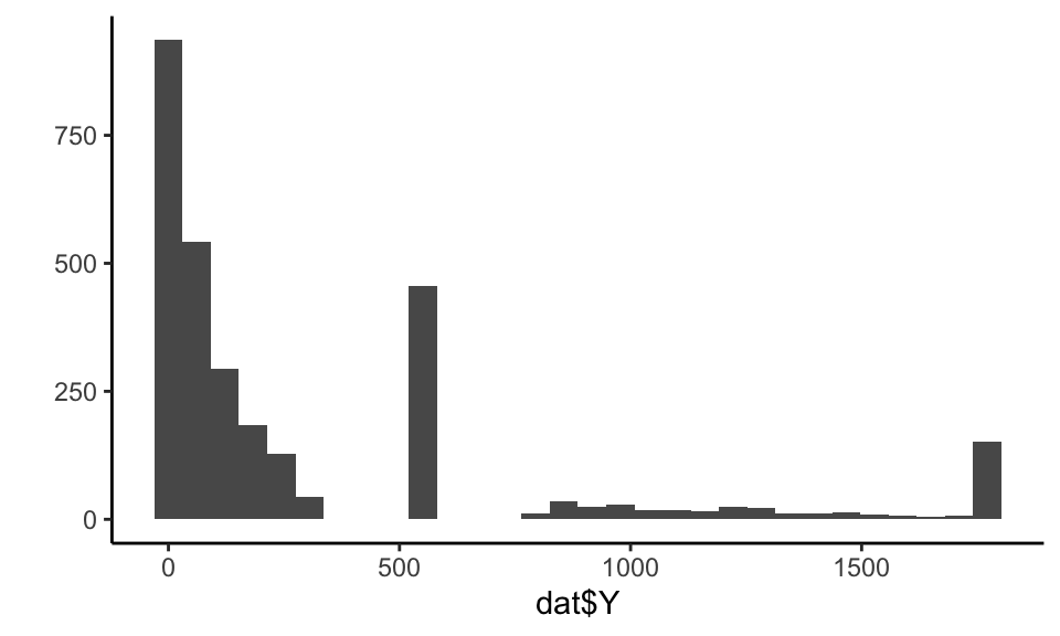
The covariates have a correlation structure with themselves and also Y. Here are the pairwise correlations on the raw values:
print( round( cor( dat ), digits = 2 ) )## X1 X2 X3 X4 Y
## X1 1.00 -0.22 0.33 0.80 0.52
## X2 -0.22 1.00 0.21 -0.19 0.20
## X3 0.33 0.21 1.00 0.27 0.66
## X4 0.80 -0.19 0.27 1.00 0.43
## Y 0.52 0.20 0.66 0.43 1.00We want to generate synthetic data that captures the correlation structure of our empirical data along with the marginal distributions of each covariate and outcome. We will do this via the following steps:
Steps for making data with a copula:
- Predict \(Y\) given the full set of covariates \(X\) using a machine learner.
- Tie \(\hat{Y}_i\) and \(Y_i\) together with a copula.
- Generate new \(X\)s (in our case, via the bootstrap).
- Generate a predicted \(\hat{Y}_i\) for each \(X_i\) using the machine learner.
- Generate the final, observed, \(Y_i\) using a copula that ties \(\hat{Y}_i\) to \(Y_i\).
Witness!
Step 1. Predict the outcome given the covariates
We can use some machine learning model to make predictions of \(Y\) given \(X\). Here we use a random forest:
library(randomForest)
mod <- randomForest( Y ~ .,
                     data=dat,
                     ntree = 200 )
dat$Y_hat = predict( mod )
Our predictive model for \(Y\) can be anything we want: we are just trying to get some predicted \(Y\) that is appropriately tied to the \(X\).
Our predictions will be under dispersed and not natural in appearance. For starters, the standard deviation of the \(\hat{Y}\) will be less than the original \(Y\), because our predictions are only getting at the structural aspects, not the residual noise:
tibble( sd_Yhat = sd( dat$Y_hat ),
        sd_Y = sd( dat$Y ),
        cor = cor( dat$Y_hat, dat$Y ) ) %>%
knitr::kable( digits = c(1,1,2) )| sd_Yhat | sd_Y | cor |
|---|---|---|
| 330.8 | 478.2 | 0.9 |
Our synthetic \(Y\) values will need to be “noised up” so they look more natural. We also want them to match the empirical distribution of our original data.
See how, for our original data, the Y-hats and Ys compare:
library(patchwork)
p1 <- ggplot( dat, aes( Y_hat, Y ) ) +
  geom_point( alpha=0.10 ) +
  geom_smooth( se=FALSE ) +
  coord_fixed() +
  labs( title = "Y_hat vs Y" )

p2 <- ggplot( dat, ) +
  geom_histogram( aes( Y_hat, fill="Y_hat" ), bins = 30, alpha=0.5 ) +
  geom_histogram( aes( Y, fill="Y" ), bins = 30, alpha=0.5 ) +
  labs( title = "Densities of orginal Y\nand predicted Y",
        fill = "Outcome", y = "", x = "Value") +
  theme(
    axis.title.y = element_blank(),
    axis.text.y = element_blank(),
    axis.ticks.y = element_blank(),
    axis.line.y = element_blank()
  )
p1 + p2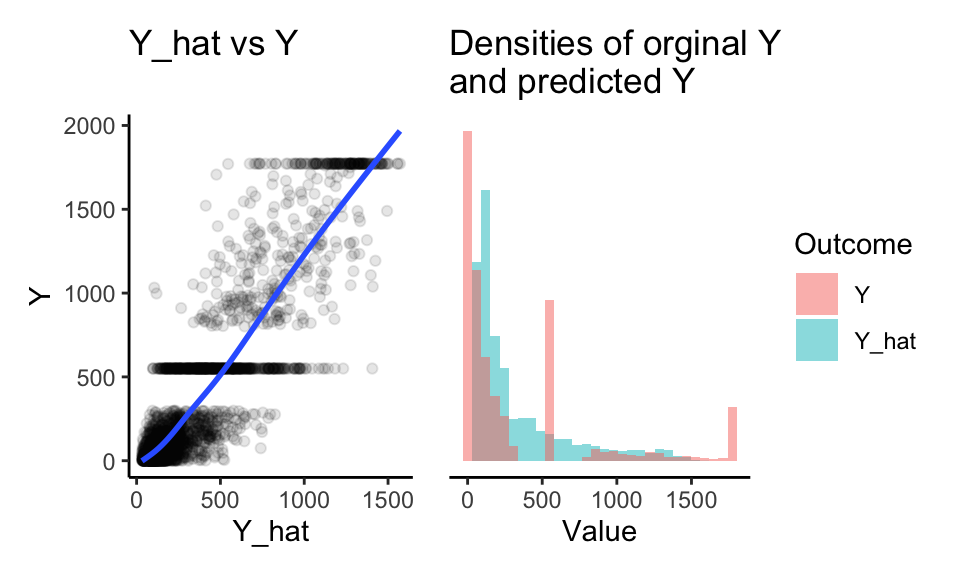
First, our \(\hat{Y}\) do fairly well for predicting \(Y\), as the loess line on the left shows. Also note the high correlations above. Driving this home further, our nominal \(R^2\) is:
1 - var( dat$Y - dat$Y_hat ) / var( dat$Y )## [1] 0.76297Second, our predicted Ys are underdispersed. We never predict 0, when our original Ys have lots of 0s. We also never predict the large number of extreme values. Finally our predicted \(Y\) do not have the same gaps and spikes as the original. We have lost marginal structure. Let’s fix this.
Step 2. Tie \(\hat{Y}\) to \(Y\) with a copula
The first step of the copula approach is to make a function that converts empirical data to normalized z-scores based on their percentile rank, as we will be doing all our data generation in “normal z-score space.” In other words, we take a value, calculate its percentile, and then calculate what z-score that percentile would have, if the value came from a standard normal distribution.
Here is a function to do this:
convert_to_z <- function( Y ) {
  K = length(Y)
  r_Y <- rank( Y, ties.method = "random" )/K - 1/(2*K)
  z <- qnorm( r_Y )
  z
}
We calculate percentiles by ranking the values, and then taking the midpoint of each rank. If we had 20 values, for example, we would then have percentiles of 5%, 15%, …, 95%. (We can’t have 0 or 100% since this will turn into Infinity when converting to a z-score.)
Using our function, we convert both our \(Y\) and predicted \(Y\) to these normal z-scores:
z_Y = convert_to_z( dat$Y )
z_Yhat = convert_to_z( dat$Y_hat )

qplot( z_Y, z_Yhat, asp = 1, alpha=0.05 ) +
  geom_abline( slope=1, intercept=0, col="red" ) +
  labs( title = "z-scores of Y vs predicted Y" ) +
  coord_fixed() +
  theme( legend.position = "none" )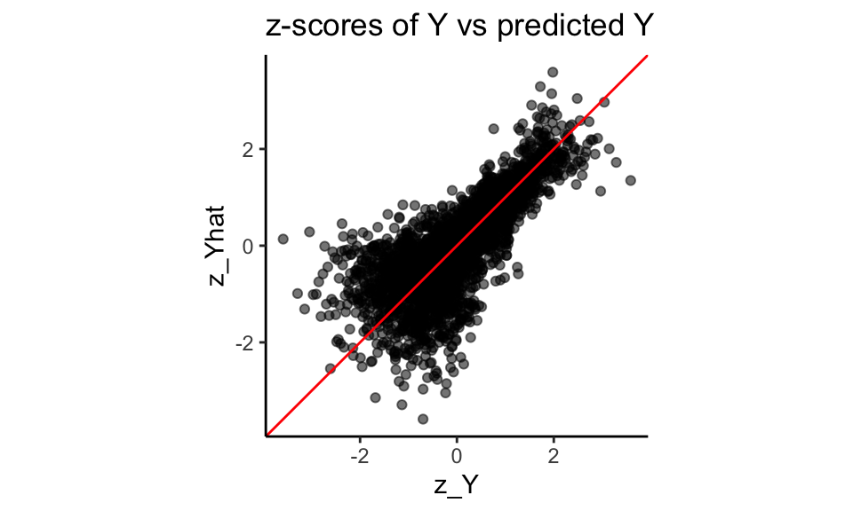
Note how the z-scores have smoothed our Y distribution due to the random ties, breaking up our spikes of identical values. We can then see how coupled the predicted and actual are:
stats <- tibble(
  rho = cor( z_Y, z_Yhat ),
  sd_Y = sd( z_Y ),
  sd_Yhat = sd( z_Yhat ) )
stats
## # A tibble: 1 × 3
## rho sd_Y sd_Yhat
## <dbl> <dbl> <dbl>
## 1 0.765 1.00 1.00Step 3. Get some new Xs
So far we are just modeling relationship in our original data. We next set the stage for generating a new dataset. We start with making more \(X\) values. A simple trick is to simply bootstrap the data, keeping the \(X\) only. We might, for example, generate a new dataset of 500 observations like so:
nd = dat %>%
  dplyr::select( starts_with("X") ) %>%
  slice_sample( n = 500, replace = TRUE )
If we don’t want exact duplicates of the vectors of \(X\) values in our data, we can use other methods such as the synthpop package, which generates data based on a series of conditional distributions.
We can also use a copula, as described in the next big section, below, for a different example.
Moving forward in this post, we are going to cheat and use a dataset, new_data that is generated from the same DGP as our original fake data.
It looks like so:
## # A tibble: 3,000 × 5
##       X1    X2    X3     X4      trueY
##    <dbl> <dbl> <dbl>  <dbl>      <dbl>
##  1     6     0  3.36  3.35   260.
##  2     0     1  2.37 -1.96     7.29
##  3     0     1  2.97 -0.191   30.5
##  4     3     1  7.45  2.22  1772.
##  5     5     1  5.61  3.44   550
##  6    -1     1  4.28 -1.65    57.9
##  7     2     1  3.03  2.55   167.
##  8    -2     1  4.34 -2.84     0.00416
##  9     5     1  5.11  2.91   550
## 10     4     1  5.54  1.28   550
## # ℹ 2,990 more rows
To be very specific, trueY would not normally be in our data at this point; we have it here so we can compare our generated to the true to see how well our DGP is working.
In practice, we would not be able to do this: we would need to generate new \(X\) like shown above.
Just pretend new_data came from some process to make \(X\) data out of our original data.
Step 4. Generate a predicted \(\hat{Y}_i\) for each \(X_i\) using the machine learner.
This step is quite easy:
new_data$Yhat = predict( mod, newdata = new_data )Done!
Step 5. Generate the final, observed, \(Y_i\) using a copula that ties \(\hat{Y}_i\) to \(Y_i\).
Now we generate our new \(Y\) by converting our predictions (the Yhat) to the new \(Y\) via the copula. We are bascially using the same pieces that are in the z-score function, above.
We first generate the percentiles the Y-hats represent:
K = nrow(new_data)
new_data$r_Yhat = rank( new_data$Yhat ) / K - 1/(2*K)
summary( new_data$r_Yhat )
## Min. 1st Qu. Median Mean 3rd Qu. Max.
## 0.0001667 0.2500833 0.5000000 0.5000000 0.7499167 0.9998333We then convert the percentiles to the z-scores they represent:
new_data$z_Yhat = qnorm( new_data$r_Yhat )
summary( new_data$z_Yhat )
## Min. 1st Qu. Median Mean 3rd Qu. Max.
## -3.5879 -0.6742 0.0000 0.0000 0.6742 3.5879We next use a formula for the conditional distribution of a normal variable given the other variable, namely, if \(X_1, X_2\) both have unit variance and mean zero, we use \[X_2 | X_1 = a \sim N( \rho a, 1 - \rho^2 ) .\] With this formula, we generate \(Y\) as so:
rho = cor( z_Y, z_Yhat ) # from our empirical
new_data$z_Y = rnorm( K,
                      mean = rho * new_data$z_Yhat,
                      sd = sqrt( 1-rho^2 ) )
Now, finally, for each observation in z-space, we figure out what rank it would correspond to in our empirical distribution, and then take that empirical data point as the value:
empDist = sort(dat$Y)
K = length(empDist)
new_data$r_Y = ceiling( pnorm( new_data$z_Y ) * K )
new_data$Y = empDist[ new_data$r_Y ]
And we are done!
How did we do?
Let’s explore results: did we end up with something “authentic”? We first compare the distribution of our generated \(Y\) to the true \(Y\) from the real DGP:
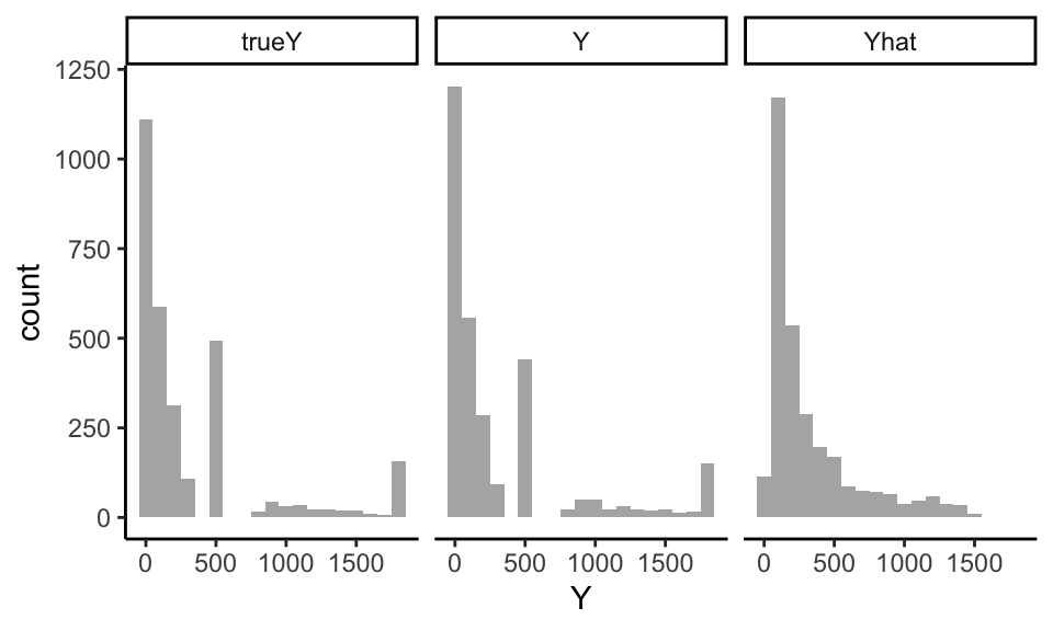
trueY and \(Y\) are very close! Note the Yhat is quite different, by contrast.
We further check our process by looking at how closely the correlations of our new Y with the Xs match the correlations of the true Y and the Xs:
cor( new_data[ c( "X1","X2", "X3", "X4", "Yhat", "Y", "trueY" ) ] ) %>%
  as.data.frame() %>%
  dplyr::select( Yhat, Y, trueY ) %>%
knitr::kable( digits = 2 )| Yhat | Y | trueY | |
|---|---|---|---|
| X1 | 0.58 | 0.41 | 0.52 |
| X2 | 0.25 | 0.20 | 0.19 |
| X3 | 0.69 | 0.48 | 0.65 |
| X4 | 0.53 | 0.38 | 0.42 |
| Yhat | 1.00 | 0.69 | 0.90 |
| Y | 0.69 | 1.00 | 0.62 |
| trueY | 0.90 | 0.62 | 1.00 |
Y roughly looks like trueY here, with respect to the correlation with the Xs. But we apparently lost some of our predictive relationship as our true Y is more tightly coupled to Yhat than our generated Y.
In our z-space we match by design; it is the transform that is distorting our relationship:
new_data$z_trueY = convert_to_z(new_data$trueY)
cor( new_data[ c( "z_Yhat", "z_Y", "z_trueY" ) ] ) %>%
knitr::kable( digits = 2 )| z_Yhat | z_Y | z_trueY | |
|---|---|---|---|
| z_Yhat | 1.00 | 0.75 | 0.78 |
| z_Y | 0.75 | 1.00 | 0.59 |
| z_trueY | 0.78 | 0.59 | 1.00 |
We gave our copula approach a hard test here–simpler covariate relationships will be better captured. That said, this doesn’t seem that bad.
Example 2: Using copulas to capture relationships behind secure data servers
In a different project my collaborators and I were running a calibrated simulation to assess whether the correlations between the size of sites, the average site outcome, and the site-level standard deviation of the outcome impacted the bias of a set of estimators. (In particular, we were looking at how a relationship between school size and school average performance might impact a multilevel model approach to multisite RDD.)
We were working with a state longitudinal system, but wanted to run the simulation on cloud computing–we didn’t need the raw data, but we did need a way to generate a realistic distribution of site sizes and site levels. We could not export the data due to privacy reasons, so we needed another way. Copulas provided that way.
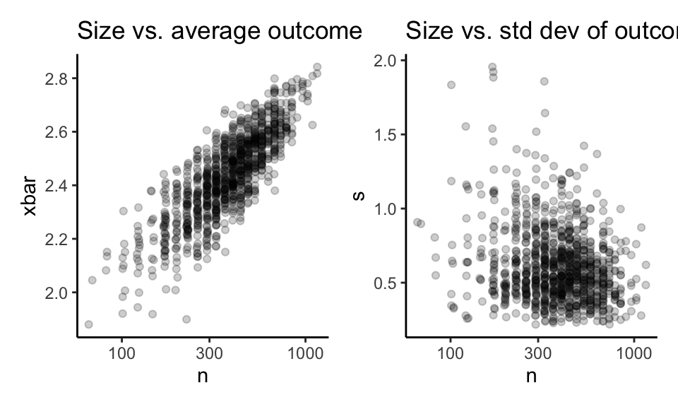
To illustrate, say we had the following school-level data calculated on the secure server:
We are going to present this approach in a two-step process:
- Generate a copula and marginal distributions that captures the relationships between the three variables and save it.
- Use the copula and saved marginal distributions to generate new data.
Step 1: Save the summary of our target variables
We first, on our secure server, generate inverse empirical cumulative density functions for size, average outcome, and standard deviation, along with correlation matrix for our three variables. We will then subsample these inverse cumulative density functions by calculating values at specific quantiles, so we are no longer looking at any individual school datapoints (otherwise R would keep the entire set of school values in the saved empirical data function). We can then save these downsampled marginal distributions along with the correlation matrix as summaries of the data; these summaries are safe to export from the secure server.
Here is our downsampling inverse ECDF function:
make_inv_ecdf = function( vals, method = "linear" ) {
  r = diff( range( vals ) )
  if ( method == "linear" ) {
    EDF = ecdf( sort( c( min(vals) - r, vals, max(vals)+r ) ) )
    cuts = seq( min(vals) - r/50, max(vals) + r/50, length.out = 300 )
  } else {
    EDF = ecdf( sort( vals ) )
    cuts = quantile(vals, probs = seq(0, 1, length.out = 300),
                    type = 1)
  }

  # Now downsample to save space and anonymize
  vals = EDF( cuts )
  vals = c( 0, vals, 1 )
  cuts = c( cuts[1], cuts, cuts[length(cuts)] )
  cuts = cuts[ !duplicated(vals) ]
  vals = vals[ !duplicated(vals) ]
  approxfun( vals, cuts, method = method )
}
Our function has two modes. method = "linear" is the default, and it uses linear interpolation to get the quantiles. "constant" is the other option, and it uses constant values between the evaluated points, which will be better for discrete distributions such as school size.
For the linear mode, we add extra points in the extremes of our distribution to make sure we have some sort of tail.
Our function return a function that we can use to calculate the quantiles of the empirical distribution. For example, here is our inverse CDF (on school size):
n_inv_ecdf = make_inv_ecdf(dd$n, method="constant")
rbind(
  real = quantile( dd$n, c( 0, 0.25, 0.5, 0.9, 1 ) ),
  appx = n_inv_ecdf( c( 0, 0.25, 0.5, 0.9, 1 ) ) )
## 0% 25% 50% 90% 100%
## real 66 290 401 678 1159
## appx 66 289 400 677 1159They match quite well. And here is for school average outcome:
xbar_inv_ecdf = make_inv_ecdf(dd$xbar)
rbind( real = quantile( dd$xbar, c( 0, 0.25, 0.5, 0.9, 1 ) ),
       appx = xbar_inv_ecdf( c( 0, 0.25, 0.5, 0.9, 1 ) ) )
## 0% 25% 50% 90% 100%
## real 1.880039 2.343087 2.447832 2.630894 2.842271
## appx 1.860794 2.342328 2.448174 2.631584 2.861515Again, match is good. We also need an ecdf for our standard deviation:
s_inv_ecdf = make_inv_ecdf( dd$s )For our copula, we are going to next get a correlation matrix of the normal-scaling of our three variables. This correlation matrix describes how our variables are related to each other. We are using the same game as the first example, with the transforms to normal space via percentiles:
dd_transformed <- dd %>%
  mutate(across(everything(), ~ (2*rank(.) - 1) / (2*n()) )) %>%
  mutate(across(everything(), qnorm))

cor_matrix <- cor(dd_transformed)
print( cor_matrix, digits = 2 )
## n xbar s
## n 1.00 0.82 -0.19
## xbar 0.82 1.00 -0.15
## s -0.19 -0.15 1.00Again, the \((2 rank - 1) / (2n)\) in the rank calculation centers each observation in the mid-percentile of its rank. This avoids the problem of having a percentile of 0 or 1, which would cause problems with the quantile function.
We finally save the following four objects and export them out of the secure server:
save( n_inv_ecdf, xbar_inv_ecdf, s_inv_ecdf, cor_matrix,
      file="ecdfs.RData" )
We next generate data from our four summary objects.
Step 2: Generate data from the saved summaries
We generate data by first generating a trivariate normal, and then mapping each part back to a percentile, and then mapping that percentile to the empirical distribution:
# Make the normal variables
pts = MASS::mvrnorm(1000, mu=c(0,0,0), Sigma=cor_matrix ) %>%
  as_tibble()
pts
## # A tibble: 1,000 × 3
## n xbar s
## <dbl> <dbl> <dbl>
## 1 1.31 1.64 -1.03
## 2 0.724 0.187 -1.46
## 3 -0.0677 -0.332 1.37
## 4 0.401 -0.483 0.262
## 5 -0.138 0.264 -1.65
## 6 -0.522 -0.232 0.496
## 7 0.603 0.856 1.65
## 8 -0.677 -0.160 -2.28
## 9 -0.233 -0.504 0.642
## 10 -0.147 -0.0303 1.08
## # ℹ 990 more rows# Convert the normals to our original three variables
# via the marginal distributions
smp = pts %>%
mutate_all(.funs = c( q = pnorm ) ) %>%
mutate( n = n_inv_ecdf( n_q ),
xbar = xbar_inv_ecdf( xbar_q ),
s = s_inv_ecdf( s_q ) )
smp## # A tibble: 1,000 × 6
## n xbar s n_q xbar_q s_q
## <dbl> <dbl> <dbl> <dbl> <dbl> <dbl>
## 1 677 2.69 0.379 0.906 0.950 0.152
## 2 531 2.48 0.324 0.766 0.574 0.0725
## 3 365 2.39 0.979 0.473 0.370 0.915
## 4 445 2.37 0.626 0.656 0.314 0.603
## 5 364 2.49 0.304 0.445 0.604 0.0495
## 6 293 2.41 0.679 0.301 0.408 0.690
## 7 488 2.58 1.10 0.727 0.804 0.950
## 8 289 2.42 0.242 0.249 0.437 0.0112
## 9 361 2.37 0.714 0.408 0.307 0.739
## 10 363 2.44 0.867 0.442 0.488 0.859
## # ℹ 990 more rowsWe can look at the ECDF of our new data: they will mostly match the original. Here is the ECDF of the simulation \(n\) vs the actual ECDF of the original data (in red):
plot( ecdf( smp$n ) )
plot( ecdf( dd$n ), col="red", add=TRUE )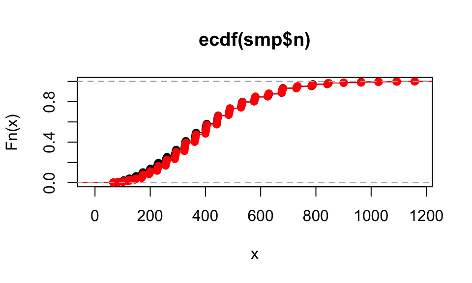
Our pairwise plots look close as well:
p1 <- qplot( smp$n, smp$xbar ) +
  labs( title="Simulated data" )
p2 <- qplot( dd$n, dd$xbar ) +
  labs( title="Original data" )
p1 + p2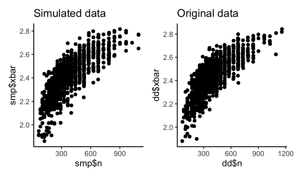
As a final check, we cut our data up into groups by size of school, and then look at the distribution of xbar and s within each group:
all_dat = bind_rows( orig=dd, fake=smp, .id="set" )

all_dat = mutate( all_dat,
                  n_c = cut( n, breaks = quantile( n, c(0,0.25,0.5,0.75,1) ), include.lowest=TRUE ) )

p1 <- ggplot( all_dat, aes( xbar, col=set ) ) +
    facet_wrap( ~ n_c, ncol=1 ) +
    geom_density() +
    theme( legend.position = "none" )

p2 <- ggplot( all_dat, aes( s, col=set ) ) +
    facet_wrap( ~ n_c, ncol=1 ) +
    geom_density() +
    theme( legend.position = "none" )
p1 + p2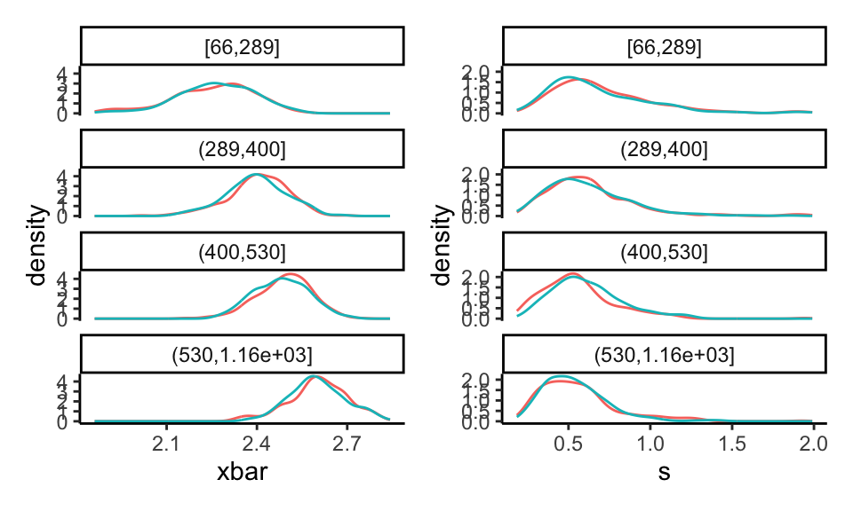
Note how the curves shift for the different groups, and our fake data basically has the same shape as the original.
Discussion
We saw two ways to generate data with the same marginal distributions for all covariates and outcome as the original data. We are approximating the underlying correlation structure between the covariates and outcome via mapping them to a multivariate gaussian after transforming each variable to be standard normal (or close to it, in the case of discrete or binary original data). This does preserve some relationships: strongly related variables remain strongly related, and so forth. That being said, we are not getting the true relationships between variables; underneath the hood we still have an implied joint normal distribution which prevents strange higher order effects, I believe.
Overall, however, using a copula does seem to be a way to generate larger datasets out of smaller ones in a manner that preserves some character of the smaller, while not having large numbers of identical observations, as a simple bootstrap approach would.
Acknowledgements
Thanks to my collaborators at MDRC, in particular Pei Zhu, Polina Polskaia, and Richard Dorsett, for the ongoing conversations and work that led to this approach. Also thanks to Sophie Litschwartz for the second example that we formulated as part of her work when at Harvard. This post was partially funded by IES’s methodology grant R305D220046, “Identifying Best Practices for Estimating Average Treatment Effects in Cluster Randomized Trials.” Any opinions, findings, and conclusions or recommendations expressed in this material are those of the authors and do not necessarily reflect the views of the IES.