Calibrating error bars to ease group comparisons
by Luke MiratrixAn annoyance (for me) is when I want to compare different groups portrayed in a nice plot that is kind enough to provide error bars. Consider a hypothetical data collection effort where we have 5 groups and are looking at the mean outcome of these 5 groups. Our estimated means and standard deviations are as follows:
| Group | n | mean | sd |
|---|---|---|---|
| Control | 100 | 9.38 | 6.87 |
| A | 100 | 11.31 | 6.71 |
| B | 100 | 6.25 | 7.15 |
| C | 100 | 9.28 | 6.85 |
| D | 100 | 8.47 | 7.21 |
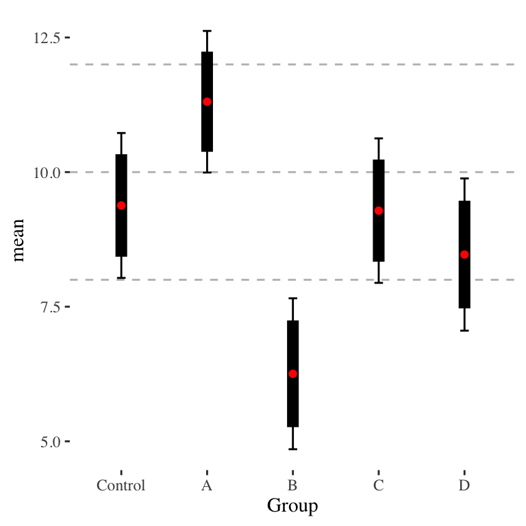
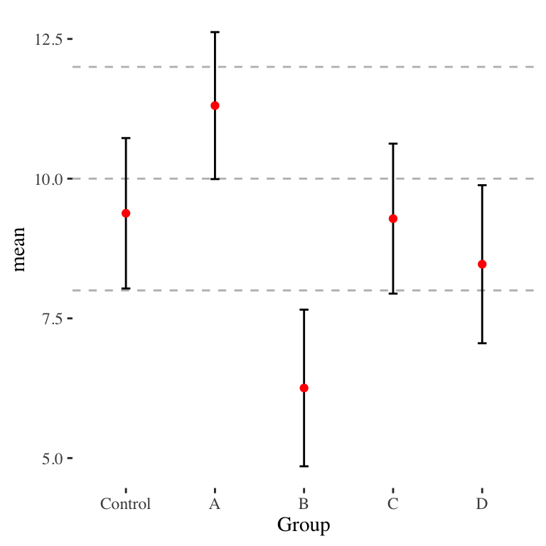
Standard errors are easily obtained with \(SE = sd(Y)/\sqrt{n}\), and using the normal approximation (fine in our case of sample sizes > 30) we can also easily generate confidence intervals for each point. We can plot all of this, obtaining Figure 1.
Now let’s consider pairwise comparisons. Visually, it is clear that group B is different from all the rest (except, maybe, D), including the control group; the confidence intervals are well separated. Groups C and D are fairly clearly not significantly distinct from Control; their confidence intervals overlap a whole lot. But what about group A? Is it significantly different from the Control? Visually, it looks like they are not. But look at a \(t\)-test of the difference:
t.test( Y ~ Group, data=filter( dd, Group %in% c("Control","A") ) )##
## Welch Two Sample t-test
##
## data: Y by Group
## t = -2.01, df = 198, p-value = 0.046
## alternative hypothesis: true difference in means between group Control and group A is not equal to 0
## 95 percent confidence interval:
## -3.820302 -0.033664
## sample estimates:
## mean in group Control mean in group A
## 9.3803 11.3073We are below 0.05!
Tweaking our error bars
So how can we visually show that Control and A are significantly distinct? One way is to adjust our error bars to not be 95% confident, but instead be just enough confident that if the wiskers touch we are at 0.05 for a test of the difference.
Assuming independence, testing for the difference is a \(t\)-statistic of \[ t = \frac{ \bar{Y}_A - \bar{Y}{co} }{\sqrt{ \widehat{SE}_A^2 + \widehat{SE}_{co}^2 }}. \] Alternatively put, the Standard Error for the difference is \[ SE_\Delta = \left( SE_A^2 + SE_{co}^2 \right)^{1/2} \] For the difference to be significant, we would want to see a gap at least \(1.96 SE_\Delta\). This means in the case of a bare rejection, when we want our whiskers to just touch, we want the whiskers of our two individual confidence intervals to sum to \(1.96 SE_\Delta\):
\[ a SE_{co} + a SE_A = 1.96 SE_\Delta \] giving \[ a = 1.96 \frac{ SE_\Delta }{ SE_{co} + SE_{A} } . \]
In our case, we get \(\widehat{SE}_\Delta = (0.68674^2 + 0.67094^2)^{1/2} = 0.96\) and then \[ \hat{a} = 1.96 \frac{ 0.96 }{ 0.69^2 + 0.67^2 } = 1.39 \] If we make the bars of our confidence intervals \(a \widehat{SE}\) they will just touch. For this particular comparison, our revised confidence interval are about 83% confident (we get our confidence level by back-calculating what confidence our \(a\) generates via \(Conf = 1 - 2\Phi( -\hat{a} )\)).
Here is a revised plot:

Control and A are clearly distinct, as they should be. We can also now do visual pair-wise comparisons (not accounting for multiple testing here) of any two groups as well. Also note how the \(a\) factor makes the bars, but the whiskers are still legitimate 95% confidence intervals for each individual group.
Struggling with unequal group sizes
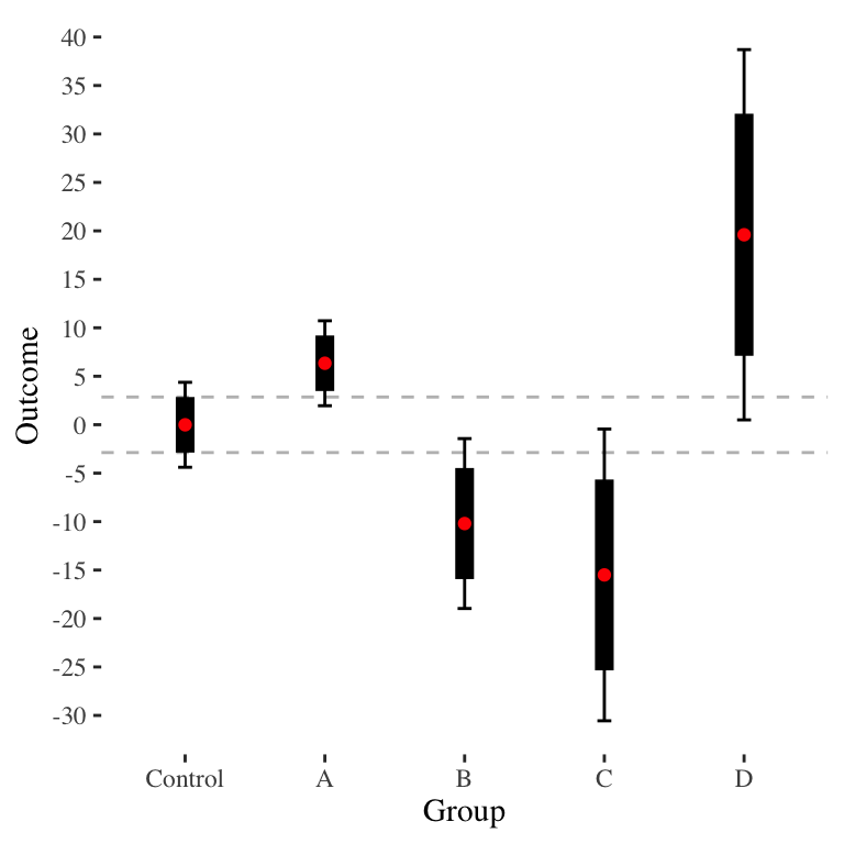
Unfortunately, the above equation will give a different \(a\) for each pairwise comparison. Consider the case of wanting to make a single plot for a circumstance such as these data:
| Group | n | mean | sd | SE |
|---|---|---|---|---|
| Control | 520 | -0.01 | 51.01 | 2.24 |
| A | 581 | 6.34 | 53.90 | 2.24 |
| B | 124 | -10.20 | 49.71 | 4.47 |
| C | 36 | -15.50 | 46.30 | 7.68 |
| D | 28 | 19.60 | 51.88 | 9.75 |
The baseline CI plot is the following:
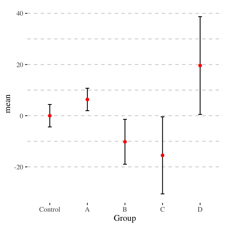
The \(a\) will actually be quite different. The following shows the \(a\) values for each group compared to the control group.
| group | mean_Control | SE_Control | mean | SE | SE_delta | t | a |
|---|---|---|---|---|---|---|---|
| A | -0.01 | 2.2361 | 6.34 | 2.2361 | 3.1623 | 2.0080 | 1.3859 |
| B | -0.01 | 2.2361 | -10.20 | 4.4721 | 5.0000 | -2.0380 | 1.4609 |
| C | -0.01 | 2.2361 | -15.50 | 7.6811 | 8.0000 | -1.9363 | 1.5811 |
| D | -0.01 | 2.2361 | 19.60 | 9.7468 | 10.0000 | 1.9610 | 1.6357 |
We can do a series of paired comparisons, but it gets a bit ugly because we end up replicating the control group. Also, it doesn’t allow all-way comparisons.
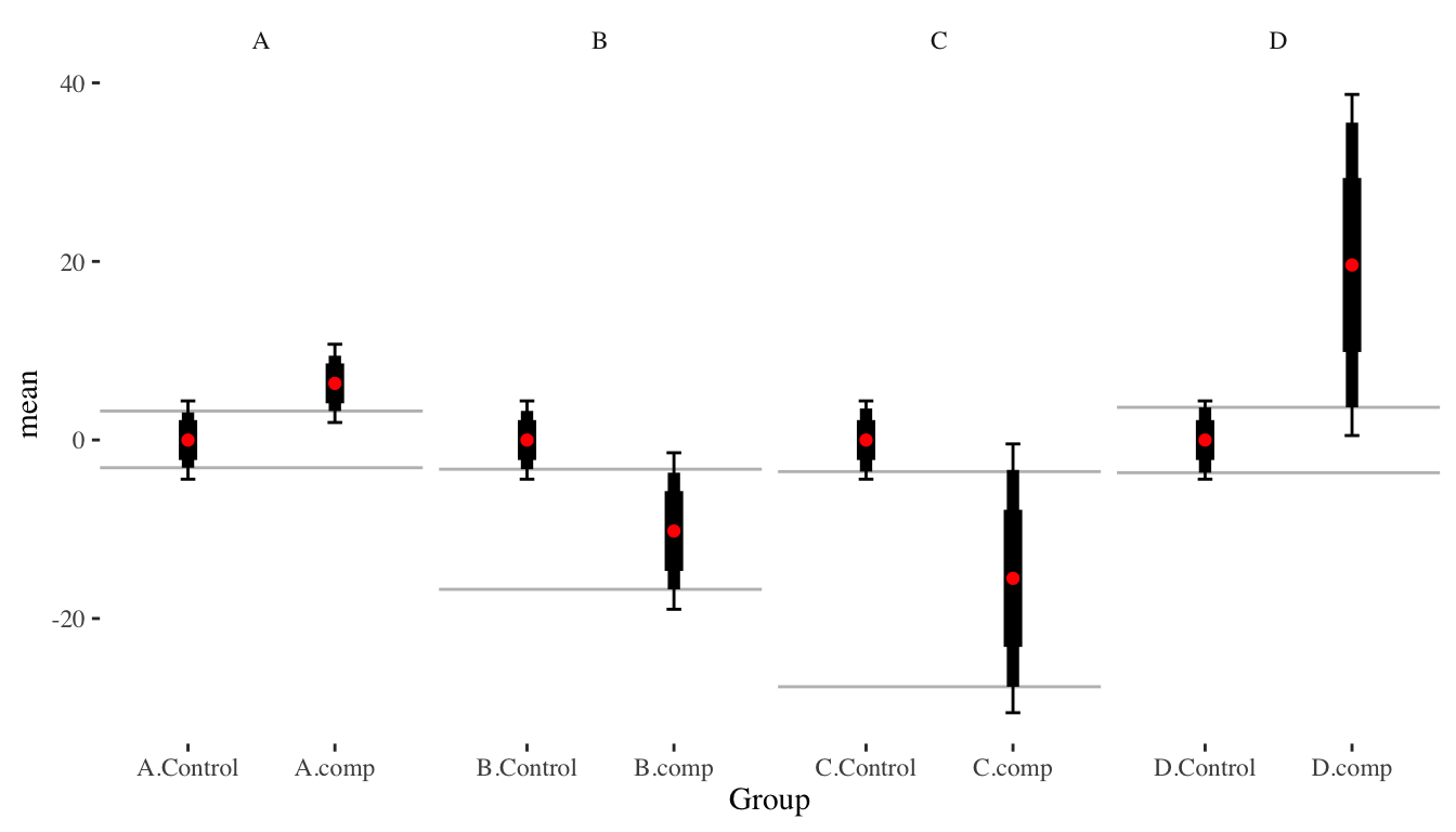
In this figure, the thickest bars are \(\pm 1 \widehat{SE}\), the medium bars are the \(\pm a \widehat{SE}\), and the whiskers are 95% confidence intervals.
This isn’t satisfying. What can be done to fix this? Is there some “rough” adjustment that will get it mostly right? I.e., if we calculate an average \(a\), or adjust each of the comparison groups relative to a fixed \(a\) for the control?
80% Confidence intervals are maybe good enough?
Even with equal sized groups, the above feels fussy. Perhaps we just show 80% confidence intervals (i.e., plus or minus 1.28 standard error). This gives:
Now we can vaguely say if the thick bars do not overlap, we are likely separated, even if the 95% intervals (the thin lines) do overlap.
The 80% confidence intervals are potentially useful for other reasons. For example, they can be useful for interpretation more generally, as discussed in the companion post on interpreting \(p\)-values; in brief, they give a nice range of plausible, even “likely” true values of our targeted parameters.
Or perhaps we are just stuck with our original plots.
Addendum
You might also check out the 2023 paper “The Significance of Differences Interval: Assessing the Statistical and Substantive Difference between Two Quantities of Interest,” by Radean (2023), that looks at this issue as well. In this paper, Radean proposes a method for calculating confidence intervals for the difference between two groups, and points out that even if the individual confidence intervals for two groups do not overlap, the proper CI for the difference may still include zero (in some cases)!